Sunday 22 April 2012
Friday 30 March 2012
Evaluation
1.) In what ways does your media product use, develop or challenge forms and conventions of real media products?
Evaluation Question 1
Evaluation Question 1
2.) How effective is the combination of your main product and ancillary texts?
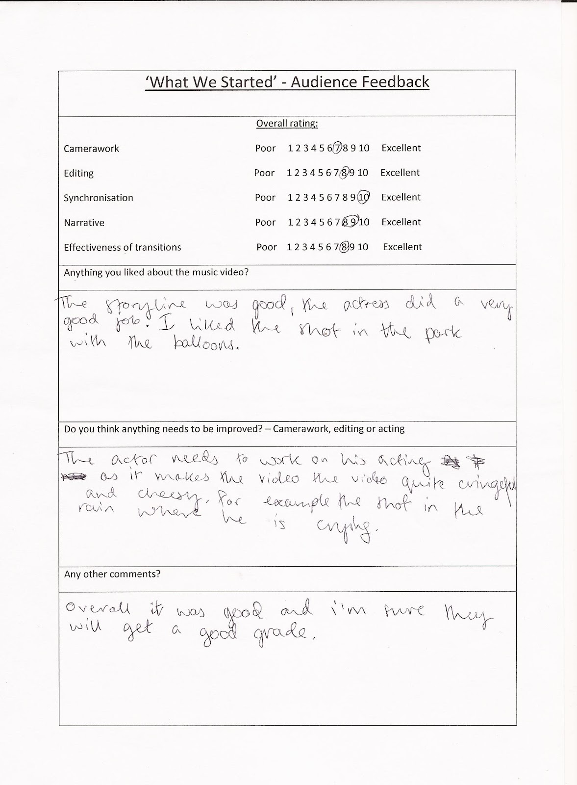
3.) What have you learned from your audience feedback?
4.) What have you learnt about technologies through the process of constructing this product?
4.) What have you learnt about technologies through the process of constructing this product?
Thursday 29 March 2012
Problems & Solutions: Digipak Construction Process
- Most of the photos from the 'Digipak Photoshoot' were naturally portrait and unfortunately when applied to a 14cmx12.5cm digipak template on Photoshop CS3 (Extended), they would become over-compressed and the dimensions were very noticeably out of proportion. Therefore, I compiled a shortlist of purely landscape photos of my artist and from this, selected the finalised choice for the digipak album artwork.
- Not being too familiar with Photoshop, it was quite time-consuming to adjust to the overwhelming functionality of the software. However, I came to discover that sheer experimentation/trial and error was the way forward and through combining the subtle enhancements Photoshop can produce (as opposed to an over-use of effects which can appear ammatur) with the user-friendly Photoscape and Picasa, I was able to create a product which had a definite air of professionalism and simplistic beauty about it.
- Probably the most annoying aspect about my Photoshop was that it decided to create a glitch within itself half-way through the construction process and would often freeze and consequently, lose all of my work. This taught me that you can never hit the 'save' button too many times!
Self-Evaluation of Digipak Artwork
Front Panel: This photo encapsulates Olly Patriarca as a youthful urban pop-star, indicated by the subtle attitude of his body language (e.g. arms crossed, head tilted back) exuding a confident character. We married this with a pair of Rayban Wayfarers and a denim aviator jacket - alternative/indie items of clothing that resonate with charismatic British male singer-songwriters such as James Morrison and Olly Murs (key style icons that inspired Patriarca's star-image). This styling gives Olly a 'guy-next-door' image which creates an identifying point with his male/female demographic and prevents his appearance from verging on egotistical which can be the common convention for most modern urban stars, such as Usher and Tinie Tempah. In addition, the logo of his interlinking initials in a graffiti-esque font appears in the top-left corner and is a graphical representation of the artist's urban nature. However, the album title and artist name appears in a sans-serif grey font to emphasise simplicity and a serious tone to the album, as an over-use of graffiti font would make the digipak look amateurish. Finally, I used a cross-process filter to give a vintage quality to the photo alongside black burnout edges, creating a cinematic moment.
Inside Panels 1&2: These two panels work together to make up a whole photo of the artist. I decided this would be more effective than compressing the landscape photo into a 14cmx12.5cm canvas, as the striking symmetrical photo appears extremely prominent and acts as the focal piece of the digipak. Furthermore, the fact Olly is 'holding up' the Jack Kerouac's quote: 'The only truth is music' alludes to the star's philosophical and passionate side (reflected in the album) and detracts from the typified 'reckless youth' British stereotype making him appear more of a musical intellect.
Inside Panel 3: Behind the CD and plastic tray is a photo of a secluded urban street from the Philippines; walls covered in artistic graffiti. I chose a black&white filter to portray an element of melancholy and then breathed some vibrant colour back into the left-half of the photo to draw attention to the graffiti art of a lively cityscape. In addition to reflecting the exploration of two juxtaposing tones on the album, this imagery represents Olly's cultural/background roots, in turn making him seem down-to-earth and personable to his audience. I wanted to steer clear of over-exposing Olly's physical appearance to the point where it would seem I was desperate to sell my artist.

 Back Panel 1: The idea of a four quarter panel was inspired by the Britpop movement as it seemed to be a common convention across albums from this genre. For example, the album artwork of 'Blur: The Best Of' and a page included in the booklet for Oasis' 'Dig Out Your Soul'. Despite Olly being an urban solo artist, I thought I would incorporate this wholly British convention and depict two quarters as close-ups of the artist and two quarters conveying his urban roots representing he will never lose sight of where he came from (e.g. the dull city street and the multi-tonal brick wall - conventions associated with city-bred artists). To give this a more urban edge, I used a vignetting effect to exude a distressed quality.
Back Panel 2: The back cover continues the motif of an urban cityscape present throughout the digipak and also evident in our music video through the choice of locations. The colourful blurry city lights against the natural simplicity of the picturesque skyline capture the authentic essence of our star perfectly - someone who is from a buzzing environment yet through music, manages to escape to a idealistic world and feels free. The tracklisting appears in a sans-serif light grey font which is similar to the front cover titles, maintaining continuity throughout the digipak to avoid looking tacky on the shop shelves. The track names are JR Aquino's own but I chose these ten in particular to reflect the theme of emotional life experiences creating a personal concept album. Finally, I included institutional information such as the barcode, production/legal information, artist website platforms and the 'Mega Records' logo to complete my digipak.
Reflective Final Thought
Music Video Analysis - 'The Masterplan' by Oasis
'The Masterplan' by Oasis
(Directed by Ben & Greg, 2006)
An L.S. Lowry inspired animate promo video
Every time I watch the music video for 'The Masterplan', I am reminded of just how much I love Oasis. The animated video pays tribute to L.S Lowry and amplifies the journey or the masterplan the Gallagher brothers took from working-class Mancunians to being, in my opinion, one of the greatest rock n' roll bands of all time.
Quite unconventionally, the music video opens with a slow high-angled tracking shot (ties in with Lowry and the concept of 'perspective') which provides an overview of an industrial-esque Manchester and the viewer is invited into the run-down streets of Burnage (where the Gallaghers were raised). A cross-dissolve transition is cued by the heavy, melancholy bass-line and is unusually used to cut in closer towards the town as opposed to signal a passing of time. Furthermore, wipe transitions are used in the video to showcase a change of location. For example, long-shots of a man buying a newspaper, a man being dragged out of his house by police and of the band members emerging out of their doors in unison are all scenes intercepted with wipe transitions, perhaps to amplify the mundane, repetitiveness and sheer normality of such days. The band members wait for Liam to emerge and his legendary swagger is displayed - a famous trait taken from his star-image and incorporated into this animation so the audience still recognise him as the focal point. Subsequently, on their way to meet Noel, the four members recreate the Beatles' classic Abbey Road front cover by walking single file across a zebra crossing (intertexual reference), with Liam leading the way likening himself to John Lennon; his musical icon.
Quite unconventionally, the music video opens with a slow high-angled tracking shot (ties in with Lowry and the concept of 'perspective') which provides an overview of an industrial-esque Manchester and the viewer is invited into the run-down streets of Burnage (where the Gallaghers were raised). A cross-dissolve transition is cued by the heavy, melancholy bass-line and is unusually used to cut in closer towards the town as opposed to signal a passing of time. Furthermore, wipe transitions are used in the video to showcase a change of location. For example, long-shots of a man buying a newspaper, a man being dragged out of his house by police and of the band members emerging out of their doors in unison are all scenes intercepted with wipe transitions, perhaps to amplify the mundane, repetitiveness and sheer normality of such days. The band members wait for Liam to emerge and his legendary swagger is displayed - a famous trait taken from his star-image and incorporated into this animation so the audience still recognise him as the focal point. Subsequently, on their way to meet Noel, the four members recreate the Beatles' classic Abbey Road front cover by walking single file across a zebra crossing (intertexual reference), with Liam leading the way likening himself to John Lennon; his musical icon.


Although one probably wouldn't expect, camera movements prove to be such a vital part of this music video, in terms of connecting the present with the future and reality to fantasy. Once again, another point of view shot helps the viewer experience Noel's 'daydreamer' mind state as a child and similar to the above-mentioned Titanic-like shot, the camera rapidly tracks down 'life's endless corridor' building tension as the music reaches a climatic point (strong, defining link between the lyrics and the visuals) to reveal Oasis performing in a larger venue, representing how the band started off playing the smallest venues and progressed to selling out mammoth rock venues such as Knebworth, Wembley Stadium, Slane Castle etc. In this second performance scene, the camera (audience p.o.v) pans around the band in admiration and awe of their accomplishments.
In reverse to the beginning of the video, the camera tracks backwards to reveal a high-angled perspective and Oasis appear triumphant after playing their 'large' show (in a fairground tent). This is demonstrated through the vibrant tone and colour of the shot which vividly juxtaposes with the dull and depressing atmosphere that Burnage emitted. Furthermore, as the electric guitar/ orchestral fused solo reaches a climax, fantasy begins to fade and the band return back to the worn-out streets of their hometown. They walk past Johnny Roadhouse Music - a music shop from with the Gallagher brothers frequently bought equipment from at the beginning of their career. This reinforces the notion that the earlier performances were but a mere fantasy and the constant narrative shift throughout is reflective of the very start of Oasis' career when they were big daydreamers stuck in a repetitive, cyclical lifestyle represented through the circular structure of this video. Also, at 4:50, Noel can be heard distortedly singing the chorus from 'Octopus's Garden' by The Beatles. Yet another intertexual link referring to The Beatles highlight just how much of an influence they were on Oasis; hence this music video pays homage to them.
To conclude, the band members all return to their terraced apartments and nightfall covers the town of Burnage, with the camera tracking outwards at a high-angle, reminiscent of the beginning of the music video.

 |
| July 11th 2009 |


Wednesday 28 March 2012
Specific Album Art/Digipak Analysis (The Chaos - The Futureheads)
The Chaos - The Futureheads
'The Chaos' (2010) is the fourth album by British post-punk revival band, The Futureheads. It is the band's second album released on their own independent record label, Nul Records. The 4-panel digipak consists of the audio CD and booklet.
 |
| Front Panel |
The front panel presents the image of a globe ripping apart with block arrows placed around the entire circumference, representing the idea of the world being constantly torn in different directions hence the album title, 'The Chaos'. The fact that the globe is splitting to reveal the earth's inner core may signify how humanity is slowly destroying the planet. The band were inspired by 2010 political events and this album is full of allusions to being disaffected with the society and government of Britain. Guitarist Ross Millard exclaimed: 'There's a certain responsibility to address to what's going on.' In addition to the music, the eye-catching, statement image depicted on the front cover definitely encapsulates the band's urgent 'warning' to re-examine the state of Britain.
Unlike the Red Hot Chili Pepper's 'I'm With You' (see RHCP digipak/album artwork analysis: here) which opts for a discreet presentation of the album title/band name, The Futureheads make their title and band name as striking and bold as the focal artwork. The black sans-serif font reiterates the idea of a 'warning' (a motif) and the subtle destroyed/decaying effect that adds a touch of decoration/serif appearance to the font, reflecting the world's metaphorical deterioration.


 The motif of astrological diagrams appears inside the digipak and in the booklet (concealed in the left tube pocket). This recurring imagery is quite foreboding and reinforces the point that the world is heading towards 'chaos' sooner than expected. Each astrological image serves as a 'warning signal' which constantly highlight the band's message and makes them seem most relevant to British culture. Furthermore, the product adheres to the conventional digipak format with a plastic tray to hold the CD. Although digipaks are viewed as a more creative alternative to jewel cases (with numerous artwork panels), a disadvantage of digipak plastic trays are the brittle teeth of the hub which can often break. Additonally, plastic trays aren't environmentally friendly and in all honesty, The Futureheads should perhaps have opted for a tray made from sugarcane or egg carton to reflect their 'concerns' about the state of the earth!
  Another disadvantage of digipaks are that they are less resistant to abrasion that jewel cases. I definitely found this to be true as this Futureheads album appears quite tattered at the corners and the spine is beginning to weaken.
 |
| Back Panel |
The back panel of the digipak illustrates the tracklisting in the same statement font which features on the front panel, maintaining a sense of continuity and avoiding tackiness. The barcode is placed at the top-centre and the production information at the bottom-centre along with the band's website and record label logo; Nul Records. A 'central alingment' creates a strong impression of order - contrasting with the themes explored on the album, i.e. corruption.
Specific Album Art/Digipak Analysis - (The Secret Life...Two Lectures by Nick Cave)
The Secret Life Of The Love Song & The Flesh Made Word
Two Lectures By Nick Cave
Nick Cave is an Australian musician best known as the frontman of the critically acclaimed alternative rock band, Nick Cave and the Bad Seeds. Other than containing the CD, this digipak is far from the conventional. It resonates an autobiographical book, with pages displaying extracts from the two lectures on the CD along with black and white photos of the musician.
 | |||
| Front Cover |
The front cover is a black and white mid-shot of Cave staring analytically at a record. This striking image may be representative of his philosophical nature and relates to his 'two lectures' featured on the CD, in which the artist delves into the complexity of the 'love song' and explores how religion helped to influence his writing. Furthermore, the fact that the CD is interspersed with five examples of 'true love songs' by Cave himself, conveys to the audience how 'love lies within the music' - perhaps this would explain why Cave is seemingly searching the record on the front panel. Additionally, the classic black and white photo appears as if it's a cinematic still taken from a romantic film, creating a 'motif' for the artist as the theme of love and mystery are concepts explored in great depth on the album. The key light is hard/focused through the centre of his face and on his hand, whereas the rest of his form and dimension appears silhouette-like; an effect that is achieved by omitting the key light instead. Overall, this gives Cave a mysterious and haunting quality which meshes perfectly with his dark, brooding music.
 | |
| An autobiographical format: To the left, another classic/cinematic moment is captured on film; Cave in the studio recording 'West Country Girl' (a love song featured on the album). To the right, an extract from 'The Secret Life...' is displayed, commencing with the sentence: 'That was a song called West Country Girl'. In essence, this digipak is designed to be read along with Cave's CD (this extract opens the album like it does with the digipak), to allow the audience to connect with the artist on a more intellectual and personal level. |
 |
| A motif of black and white, cinematic photographs of Cave at the recording sessions run throughout the digipak to capture his immense creativity (left: Cave with an electric violin) and his melancholic, sensitive persona (evident in the right-hand photo) all in a snapshot. The abundance of intriguing photos make the listening experience more pleasurable for the audience, as they are provided with visuals to accompany Cave's lectures and compositions. |
 | |
| The quotations included in the digipak are specifically selected to provide an overview of Cave's lectures. For example, in the extract above, the artist mentions 'the love song', 'our senses', 'God' and his own songs. Moreover, this provides an overall representation of Cave as a spiritual individual and a philosophical, intellectual thinker. |
 |
Since this digipak follows a book-like format, the audio CD is held in a cardboard tube pocket (disguised merely as another page). This design is a great alternative to jewel cases which are prone to cracking and the conventional plastic tray in digipaks which possess the disadvantage of cracking also as the teeth of the hub are quite fragile. Although the hardback book format ensures double protection of the CD, consequently, production costs would be higher than for the conventional cardboard digipak.
 |
| Back Cover |
The tracklisting of the five songs appears horizontally at the top of the back cover, quite unconventional to typical tracklistings which seem to run in the form of a list. A religious quotation is also presented which not only reflects how significant religion is to the artist as it has undoubtedly influenced his music, but also mimics a 'blurb' on the back of a book. Again, this is another signifier (alongside another photo) which supports the idea that this album is a mini-autobiography. The barcode, production/legal information and record label logo: 'King Mob Records' are also illustrated - the staple key conventions of any digipak.
Subscribe to:
Posts (Atom)