Sunday, 22 April 2012
Friday, 30 March 2012
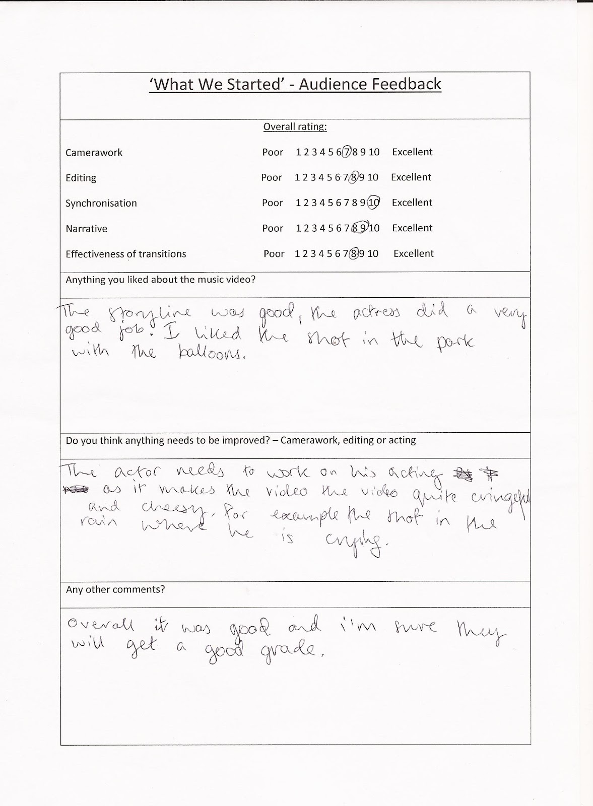
Evaluation
1.) In what ways does your media product use, develop or challenge forms and conventions of real media products?
Evaluation Question 1
Evaluation Question 1
2.) How effective is the combination of your main product and ancillary texts?
3.) What have you learned from your audience feedback?
4.) What have you learnt about technologies through the process of constructing this product?
4.) What have you learnt about technologies through the process of constructing this product?
Thursday, 29 March 2012
Problems & Solutions: Digipak Construction Process
- Most of the photos from the 'Digipak Photoshoot' were naturally portrait and unfortunately when applied to a 14cmx12.5cm digipak template on Photoshop CS3 (Extended), they would become over-compressed and the dimensions were very noticeably out of proportion. Therefore, I compiled a shortlist of purely landscape photos of my artist and from this, selected the finalised choice for the digipak album artwork.
- Not being too familiar with Photoshop, it was quite time-consuming to adjust to the overwhelming functionality of the software. However, I came to discover that sheer experimentation/trial and error was the way forward and through combining the subtle enhancements Photoshop can produce (as opposed to an over-use of effects which can appear ammatur) with the user-friendly Photoscape and Picasa, I was able to create a product which had a definite air of professionalism and simplistic beauty about it.
- Probably the most annoying aspect about my Photoshop was that it decided to create a glitch within itself half-way through the construction process and would often freeze and consequently, lose all of my work. This taught me that you can never hit the 'save' button too many times!
Self-Evaluation of Digipak Artwork
Front Panel: This photo encapsulates Olly Patriarca as a youthful urban pop-star, indicated by the subtle attitude of his body language (e.g. arms crossed, head tilted back) exuding a confident character. We married this with a pair of Rayban Wayfarers and a denim aviator jacket - alternative/indie items of clothing that resonate with charismatic British male singer-songwriters such as James Morrison and Olly Murs (key style icons that inspired Patriarca's star-image). This styling gives Olly a 'guy-next-door' image which creates an identifying point with his male/female demographic and prevents his appearance from verging on egotistical which can be the common convention for most modern urban stars, such as Usher and Tinie Tempah. In addition, the logo of his interlinking initials in a graffiti-esque font appears in the top-left corner and is a graphical representation of the artist's urban nature. However, the album title and artist name appears in a sans-serif grey font to emphasise simplicity and a serious tone to the album, as an over-use of graffiti font would make the digipak look amateurish. Finally, I used a cross-process filter to give a vintage quality to the photo alongside black burnout edges, creating a cinematic moment.
Inside Panels 1&2: These two panels work together to make up a whole photo of the artist. I decided this would be more effective than compressing the landscape photo into a 14cmx12.5cm canvas, as the striking symmetrical photo appears extremely prominent and acts as the focal piece of the digipak. Furthermore, the fact Olly is 'holding up' the Jack Kerouac's quote: 'The only truth is music' alludes to the star's philosophical and passionate side (reflected in the album) and detracts from the typified 'reckless youth' British stereotype making him appear more of a musical intellect.
Inside Panel 3: Behind the CD and plastic tray is a photo of a secluded urban street from the Philippines; walls covered in artistic graffiti. I chose a black&white filter to portray an element of melancholy and then breathed some vibrant colour back into the left-half of the photo to draw attention to the graffiti art of a lively cityscape. In addition to reflecting the exploration of two juxtaposing tones on the album, this imagery represents Olly's cultural/background roots, in turn making him seem down-to-earth and personable to his audience. I wanted to steer clear of over-exposing Olly's physical appearance to the point where it would seem I was desperate to sell my artist.

 Back Panel 1: The idea of a four quarter panel was inspired by the Britpop movement as it seemed to be a common convention across albums from this genre. For example, the album artwork of 'Blur: The Best Of' and a page included in the booklet for Oasis' 'Dig Out Your Soul'. Despite Olly being an urban solo artist, I thought I would incorporate this wholly British convention and depict two quarters as close-ups of the artist and two quarters conveying his urban roots representing he will never lose sight of where he came from (e.g. the dull city street and the multi-tonal brick wall - conventions associated with city-bred artists). To give this a more urban edge, I used a vignetting effect to exude a distressed quality.
Back Panel 2: The back cover continues the motif of an urban cityscape present throughout the digipak and also evident in our music video through the choice of locations. The colourful blurry city lights against the natural simplicity of the picturesque skyline capture the authentic essence of our star perfectly - someone who is from a buzzing environment yet through music, manages to escape to a idealistic world and feels free. The tracklisting appears in a sans-serif light grey font which is similar to the front cover titles, maintaining continuity throughout the digipak to avoid looking tacky on the shop shelves. The track names are JR Aquino's own but I chose these ten in particular to reflect the theme of emotional life experiences creating a personal concept album. Finally, I included institutional information such as the barcode, production/legal information, artist website platforms and the 'Mega Records' logo to complete my digipak.
Reflective Final Thought
Music Video Analysis - 'The Masterplan' by Oasis
'The Masterplan' by Oasis
(Directed by Ben & Greg, 2006)
An L.S. Lowry inspired animate promo video
Every time I watch the music video for 'The Masterplan', I am reminded of just how much I love Oasis. The animated video pays tribute to L.S Lowry and amplifies the journey or the masterplan the Gallagher brothers took from working-class Mancunians to being, in my opinion, one of the greatest rock n' roll bands of all time.
Quite unconventionally, the music video opens with a slow high-angled tracking shot (ties in with Lowry and the concept of 'perspective') which provides an overview of an industrial-esque Manchester and the viewer is invited into the run-down streets of Burnage (where the Gallaghers were raised). A cross-dissolve transition is cued by the heavy, melancholy bass-line and is unusually used to cut in closer towards the town as opposed to signal a passing of time. Furthermore, wipe transitions are used in the video to showcase a change of location. For example, long-shots of a man buying a newspaper, a man being dragged out of his house by police and of the band members emerging out of their doors in unison are all scenes intercepted with wipe transitions, perhaps to amplify the mundane, repetitiveness and sheer normality of such days. The band members wait for Liam to emerge and his legendary swagger is displayed - a famous trait taken from his star-image and incorporated into this animation so the audience still recognise him as the focal point. Subsequently, on their way to meet Noel, the four members recreate the Beatles' classic Abbey Road front cover by walking single file across a zebra crossing (intertexual reference), with Liam leading the way likening himself to John Lennon; his musical icon.
Quite unconventionally, the music video opens with a slow high-angled tracking shot (ties in with Lowry and the concept of 'perspective') which provides an overview of an industrial-esque Manchester and the viewer is invited into the run-down streets of Burnage (where the Gallaghers were raised). A cross-dissolve transition is cued by the heavy, melancholy bass-line and is unusually used to cut in closer towards the town as opposed to signal a passing of time. Furthermore, wipe transitions are used in the video to showcase a change of location. For example, long-shots of a man buying a newspaper, a man being dragged out of his house by police and of the band members emerging out of their doors in unison are all scenes intercepted with wipe transitions, perhaps to amplify the mundane, repetitiveness and sheer normality of such days. The band members wait for Liam to emerge and his legendary swagger is displayed - a famous trait taken from his star-image and incorporated into this animation so the audience still recognise him as the focal point. Subsequently, on their way to meet Noel, the four members recreate the Beatles' classic Abbey Road front cover by walking single file across a zebra crossing (intertexual reference), with Liam leading the way likening himself to John Lennon; his musical icon.


Although one probably wouldn't expect, camera movements prove to be such a vital part of this music video, in terms of connecting the present with the future and reality to fantasy. Once again, another point of view shot helps the viewer experience Noel's 'daydreamer' mind state as a child and similar to the above-mentioned Titanic-like shot, the camera rapidly tracks down 'life's endless corridor' building tension as the music reaches a climatic point (strong, defining link between the lyrics and the visuals) to reveal Oasis performing in a larger venue, representing how the band started off playing the smallest venues and progressed to selling out mammoth rock venues such as Knebworth, Wembley Stadium, Slane Castle etc. In this second performance scene, the camera (audience p.o.v) pans around the band in admiration and awe of their accomplishments.
In reverse to the beginning of the video, the camera tracks backwards to reveal a high-angled perspective and Oasis appear triumphant after playing their 'large' show (in a fairground tent). This is demonstrated through the vibrant tone and colour of the shot which vividly juxtaposes with the dull and depressing atmosphere that Burnage emitted. Furthermore, as the electric guitar/ orchestral fused solo reaches a climax, fantasy begins to fade and the band return back to the worn-out streets of their hometown. They walk past Johnny Roadhouse Music - a music shop from with the Gallagher brothers frequently bought equipment from at the beginning of their career. This reinforces the notion that the earlier performances were but a mere fantasy and the constant narrative shift throughout is reflective of the very start of Oasis' career when they were big daydreamers stuck in a repetitive, cyclical lifestyle represented through the circular structure of this video. Also, at 4:50, Noel can be heard distortedly singing the chorus from 'Octopus's Garden' by The Beatles. Yet another intertexual link referring to The Beatles highlight just how much of an influence they were on Oasis; hence this music video pays homage to them.
To conclude, the band members all return to their terraced apartments and nightfall covers the town of Burnage, with the camera tracking outwards at a high-angle, reminiscent of the beginning of the music video.

 |
| July 11th 2009 |


Wednesday, 28 March 2012
Specific Album Art/Digipak Analysis (The Chaos - The Futureheads)
The Chaos - The Futureheads
'The Chaos' (2010) is the fourth album by British post-punk revival band, The Futureheads. It is the band's second album released on their own independent record label, Nul Records. The 4-panel digipak consists of the audio CD and booklet.
 |
| Front Panel |
The front panel presents the image of a globe ripping apart with block arrows placed around the entire circumference, representing the idea of the world being constantly torn in different directions hence the album title, 'The Chaos'. The fact that the globe is splitting to reveal the earth's inner core may signify how humanity is slowly destroying the planet. The band were inspired by 2010 political events and this album is full of allusions to being disaffected with the society and government of Britain. Guitarist Ross Millard exclaimed: 'There's a certain responsibility to address to what's going on.' In addition to the music, the eye-catching, statement image depicted on the front cover definitely encapsulates the band's urgent 'warning' to re-examine the state of Britain.
Unlike the Red Hot Chili Pepper's 'I'm With You' (see RHCP digipak/album artwork analysis: here) which opts for a discreet presentation of the album title/band name, The Futureheads make their title and band name as striking and bold as the focal artwork. The black sans-serif font reiterates the idea of a 'warning' (a motif) and the subtle destroyed/decaying effect that adds a touch of decoration/serif appearance to the font, reflecting the world's metaphorical deterioration.


 The motif of astrological diagrams appears inside the digipak and in the booklet (concealed in the left tube pocket). This recurring imagery is quite foreboding and reinforces the point that the world is heading towards 'chaos' sooner than expected. Each astrological image serves as a 'warning signal' which constantly highlight the band's message and makes them seem most relevant to British culture. Furthermore, the product adheres to the conventional digipak format with a plastic tray to hold the CD. Although digipaks are viewed as a more creative alternative to jewel cases (with numerous artwork panels), a disadvantage of digipak plastic trays are the brittle teeth of the hub which can often break. Additonally, plastic trays aren't environmentally friendly and in all honesty, The Futureheads should perhaps have opted for a tray made from sugarcane or egg carton to reflect their 'concerns' about the state of the earth!
  Another disadvantage of digipaks are that they are less resistant to abrasion that jewel cases. I definitely found this to be true as this Futureheads album appears quite tattered at the corners and the spine is beginning to weaken.
 |
| Back Panel |
The back panel of the digipak illustrates the tracklisting in the same statement font which features on the front panel, maintaining a sense of continuity and avoiding tackiness. The barcode is placed at the top-centre and the production information at the bottom-centre along with the band's website and record label logo; Nul Records. A 'central alingment' creates a strong impression of order - contrasting with the themes explored on the album, i.e. corruption.
Specific Album Art/Digipak Analysis - (The Secret Life...Two Lectures by Nick Cave)
The Secret Life Of The Love Song & The Flesh Made Word
Two Lectures By Nick Cave
Nick Cave is an Australian musician best known as the frontman of the critically acclaimed alternative rock band, Nick Cave and the Bad Seeds. Other than containing the CD, this digipak is far from the conventional. It resonates an autobiographical book, with pages displaying extracts from the two lectures on the CD along with black and white photos of the musician.
 | |||
| Front Cover |
The front cover is a black and white mid-shot of Cave staring analytically at a record. This striking image may be representative of his philosophical nature and relates to his 'two lectures' featured on the CD, in which the artist delves into the complexity of the 'love song' and explores how religion helped to influence his writing. Furthermore, the fact that the CD is interspersed with five examples of 'true love songs' by Cave himself, conveys to the audience how 'love lies within the music' - perhaps this would explain why Cave is seemingly searching the record on the front panel. Additionally, the classic black and white photo appears as if it's a cinematic still taken from a romantic film, creating a 'motif' for the artist as the theme of love and mystery are concepts explored in great depth on the album. The key light is hard/focused through the centre of his face and on his hand, whereas the rest of his form and dimension appears silhouette-like; an effect that is achieved by omitting the key light instead. Overall, this gives Cave a mysterious and haunting quality which meshes perfectly with his dark, brooding music.
 | |
| An autobiographical format: To the left, another classic/cinematic moment is captured on film; Cave in the studio recording 'West Country Girl' (a love song featured on the album). To the right, an extract from 'The Secret Life...' is displayed, commencing with the sentence: 'That was a song called West Country Girl'. In essence, this digipak is designed to be read along with Cave's CD (this extract opens the album like it does with the digipak), to allow the audience to connect with the artist on a more intellectual and personal level. |
 |
| A motif of black and white, cinematic photographs of Cave at the recording sessions run throughout the digipak to capture his immense creativity (left: Cave with an electric violin) and his melancholic, sensitive persona (evident in the right-hand photo) all in a snapshot. The abundance of intriguing photos make the listening experience more pleasurable for the audience, as they are provided with visuals to accompany Cave's lectures and compositions. |
 | |
| The quotations included in the digipak are specifically selected to provide an overview of Cave's lectures. For example, in the extract above, the artist mentions 'the love song', 'our senses', 'God' and his own songs. Moreover, this provides an overall representation of Cave as a spiritual individual and a philosophical, intellectual thinker. |
 |
Since this digipak follows a book-like format, the audio CD is held in a cardboard tube pocket (disguised merely as another page). This design is a great alternative to jewel cases which are prone to cracking and the conventional plastic tray in digipaks which possess the disadvantage of cracking also as the teeth of the hub are quite fragile. Although the hardback book format ensures double protection of the CD, consequently, production costs would be higher than for the conventional cardboard digipak.
 |
| Back Cover |
The tracklisting of the five songs appears horizontally at the top of the back cover, quite unconventional to typical tracklistings which seem to run in the form of a list. A religious quotation is also presented which not only reflects how significant religion is to the artist as it has undoubtedly influenced his music, but also mimics a 'blurb' on the back of a book. Again, this is another signifier (alongside another photo) which supports the idea that this album is a mini-autobiography. The barcode, production/legal information and record label logo: 'King Mob Records' are also illustrated - the staple key conventions of any digipak.
Tuesday, 27 March 2012
Reflective Summary: Problems During the Editing Process
Problems we faced during the editing process began at the very start when we had to face what seemed like a huge leap from the user-friendly iMovie to the professional software that is Final Cut Express. At first glance, I was definitley intimidated due the the over-load of functions it seemed to possess however, after familarising myself with the software I came to realise that it was quite simplistic and overall, proved to be a great advanatge to us in terms of the sheer volume and variety of transitions we could utilise. For example, the many types of cross-dissolve, a transitions so fundamental to our music video to highlight a passing of time. Furthermore, we made great use of the colour corrector tool where we were able to subtly alter the colourisation and hue of each shot creating warm tones to compliment the 'happy memories of the past' and cooler, dull-grey tones to exude a sesne of isolation during Olly's performance/narrative scenes in the present.
Music Video Analysis - 'It Will Rain' by Bruno Mars
The music video commences with an off-kilter mid-shot of a melancholy Bruno Mars standing in front of a window which is being hit hard by the falling rain outside. Immediately, the viewer recognises that the video is illustrating a link between the lyrics and the visuals (hence the song title, 'It Will Rain'.) This strong establishing shot may seem quite simplistic on the surface, however, it is embellished with semiotics and significant meaning (polysemic). For example, the sheer fact that the shot is off-kilter almost welcomes the viewer into the artist's distorted and troubled world. Furthermore, rain possesses the connotations of hardship and despair which reflects Mars' inner emotions (also signified by his heavy head and the lingering duration of the shot); what the star is feels emotionally is portrayed to the audience through the use of visuals. Another example is the star's face is positioned to capture the 'soft' key light which gently illuminates his form, although the daylight that shines through the window seems more prominent, putting Bruno in the shadows, again symbolic of his dark, sombre mood.
The fragmented nature of this video, ever-alternating from the present narrative to flashbacks from the past and interspersed with performance and cutaways, is reflective of the withered relationship between the couple and the artist's broken emotional state; '...what we used to have, we don't have it anymore.' After the establishing mid-shot, the video depicts fast jump cuts of the couple's 'happy memories' which occur within the cosy mise-en-scene of their house. The jump cuts are mostly close-ups/extreme close-ups of the couple's reactions (smiling, laughing, kissing etc), which generally go in and out of focus creating a discentred experience, perhaps representing they are distant memories that are too painful for Mars to rekindle and they are but a mere haze on replay in his mind. Moreover, cutaways such as close-ups of the dripping vintage tap and Bruno's tapping feet are edited to mimic the slow, heavy rhythm/metre of the song - linking the music to the visuals.
A long-shot is then displayed of Bruno sitting in a derelict/run-down hall resting his feet on a bucket whilst he is surrounded by a host of other buckets; an iconic image. The artist is positioned in the centre of the frame, identifying him as the 'star' of the music video and the dramatic change of mise-en-scene (bright and cosy to dark and isolated) illustrates Bruno's desolation; hence the choice of a long-shot which makes the audience seem more distant from the star and in turn, we feel sympathetic towards him. What's more, there is a clear, recurring 'motif' of rainfall throughout the video (establishing shot, dripping tap, buckets etc) which only seems apparent during the present narrative ('sad' times); '...there'll be no clear skies, if I lose you baby, everyday it will rain.'

Monday, 26 March 2012
Sunday, 25 March 2012
MEGA RECORDS - Record Label Logo

This is my record label logo that I created using Photoshop CS3 (Extended) for my record label, 'MEGA RECORDS'.
The silhouette-like megaphone is wedged into the mouth (imitating a cigarette being smoked - exuding a causal vibe) and contrasts with the vibrant, lively and animated red lips. The imagery symbolises 'MEGA RECORDS' 'broadcasting' the fresh talent of uprising stars (such as Olly Patriarca) to the world. Furthermore, to create the text I used the sans-serif font 'Impact' as I was aiming for a simplistic yet statement design. However, I discovered the 'Text Warp' tool which enabled me to distort the text to fit the shape of the lips and in turn, gives it a funky retro 1960's quality, reflecting the nature of 'MEGA RECORDS' - a label that works with artists who maintain a modern style combined with a nostalgic, retro edge.
Saturday, 24 March 2012
Logo Sketches
 |
| (Click to enlarge) |
Above are my initial sketches for both the artist logo (left) and the record label logo (right). The concept of a logo is to provide a graphical represenattion of a brand, in this case, the brand is Olly Patriarca as an urban pop-star and Mega Records as a 'fresh talent scout' label. Essentially, logos define, communicate and represent values and it is imperative that they remain relevant for the institution and the target market. For example, I am favouring my 'Interlinking' and 'Grafiti' artist logo sketches since they represent the urban, trend-setting nature of Olly Patriarca (a city-bred artist who values his roots) in addition to being relevant to the market niche of predominanly Britsh youths since artistic grafiti encapsulates this iconography perfectly. Furthermore, both of my potential logos for the record label are relevant to the instution of Mega Records and incorporate 'lips' to create a bold, iconic image. The first design incorporates audio sound waves to signify the label as 'musical beings' also reflecting the artists signed, whereas the second sketch draws upon the connotations of a meaphone as a device that broadcasts/projects a significant message; symbolic of Mega Records broadcasting fresh new talent to the world.
Analysis of Previous Student Work - (If You Talk Too Much...- People In Planes)
My favourite music video produced by A2 Coombe Media students from previous years is for People In Planes' 'If You Talk Too Much (My Head Will Explode)'. A great strength of this work is that it demonstrates the true disjunctive nature of music video perfectly by incorporating abstract concepts such as the 'bleeding' balloon, which may represent the artist's desire to be free from all the surrounding chaos. This ambiguous development of ideas highlight how the group have chosen to relate the visuals to the song through 'amplification' - the mark of the true music video Auteur and defines the director as an artist. From my background research on music video directors, Spike Jonze is one who always amplifies the original song's meaning and effect, typically through surreal humour. I think that this particular group took inspiration from Jonze, as elements of dreamlike humour are evident in their video, for example, the comedic portrayal of the work boss and the 'day-dreamer' character played by the artist. We definitely aim to take inspiration from iconic music video directors and either illustrate, amplify or disjoin our ideas (Goodwin's Dancing in the Distraction Factory).


However, if I was producing the music video there are some flaws that I would correct. I noticed that most of the edits did not cut to the beat or key rhythm which would really benefit the video since the song possesses a strong pop/rock pulse and the fact this was ignored threw the whole experience slightly off-kilter. Additionally, there is a lack of camera movement such as stock tracking and panning shots which usually embellish music video and create a sense of dynamism. I would definitely add shots of the camera slowly tracking towards the artist sitting at the desk to 'invite' the viewers into his bizarre/insane state of mind and then pan closely around his head so the audience feel as if they are placed in his position; all of which would create an intimate connection between the artist and the audience. What's more, there is no sign of any instrumental performance and although the group may have wanted to intentionally focus on the artist himself, I would include simple instrumentation 'triggers' of the artist frustratingly tapping a pencil on the desk to emphasise the drum beat or tapping his fingers on the typewriter to imitate the melody of the guitar.
Despite the above-mentioned weak points, I adore the authentic mise-en-scene; a white box-room signifying entrapment whilst resembling a blank canvas (metaphorical for life) and all the manic occurrences that happen within this 'box' symbolise the chaotic nature of everyday life. This amplified representation of normality is surely an aspect which anyone can identify with and creates a sense of realism within the music video. Moreover, the lighting and tone of each shot is kept consistent throughout the video which meshes the entire sequence together and helps to achieve a seamless flow. This was most likely achieved using the 'colour corrector' function available in Final Cut Express, a tool which helps to fine-tune the colourisation of each shot and something we will make great use of when editing our music video.
Overall, I believe this to be an exceptionally strong music video which has inspired me to think of plenty of 'abstract' ideas to include in our own music video to increase audience intrigue. Furthermore, the group have included a variety of camera shots, mainly focusing on the predominant close-up shot to emphasise the commodity on sale - the artist, the song and the husky, rock n' roll grain of voice.
Friday, 23 March 2012
Music Website Analysis - Gorillaz Website (http://gorillaz.com/)

A music website that I have always adored is http://gorillaz.com/ - promoting British virtual band/supergroup, Gorillaz. The fabulous fictional universe of Gorillaz is not only explored through their CGI-based music videos, but also through the website; a place where fans can really indulge in the fascinating and intriguing world of the animated band. Unlike any other I have come across, this website could keep me informed and entertained for hours on end.
The web banner reads 'Gorillaz.com' and beneath is an interactive banner promoting the band's latest 12 minute track and music video 'DoYaThing'. This banner features the Gorillaz logo from the 'Plastic Beach' album and an animated picture of 2D, Murdoc and guest contributors LCD Soundystem's James Murphy and Outkast's André 3000. Although Murphy is animalised and quite unidentifiable, André is still recognisable (depsite his masked face) due to his signature top hat (an element that constructs his regular star-image). The fact that the Outkast rapper possesses a wide fanbase and is more of a worldwide star, means that fans from around the globe that visit the Gorillaz website will most likely acknowledge his guest contribution and become persuaded to listen to the new track...all at the click of a button.
The web banner reads 'Gorillaz.com' and beneath is an interactive banner promoting the band's latest 12 minute track and music video 'DoYaThing'. This banner features the Gorillaz logo from the 'Plastic Beach' album and an animated picture of 2D, Murdoc and guest contributors LCD Soundystem's James Murphy and Outkast's André 3000. Although Murphy is animalised and quite unidentifiable, André is still recognisable (depsite his masked face) due to his signature top hat (an element that constructs his regular star-image). The fact that the Outkast rapper possesses a wide fanbase and is more of a worldwide star, means that fans from around the globe that visit the Gorillaz website will most likely acknowledge his guest contribution and become persuaded to listen to the new track...all at the click of a button.

 To the top-right, fans can view broadcasts from Murdoc, Big Rick or 2D as they advertise merchandise, provide comedic band updates and cite links to various portals within the website (e.g. Murdoc's The Fall Pirate Radio Station.) These mini-broadcasts can be perceived as 'sample tweets' since below each broadcast are links to the member's twitter accounts; fans become enticed by the broadcasts and can easily access the band's twitter accounts in order to follow them 24/7. Furthermore, small icons linking fans to the Gorillaz MySpace, Facebook, YouTube, Twitter and iTunes pages provide an array of online platforms through which the band can market themselves and gain mass exposure (e.g. someone may share a Gorillaz music video on their Facebook page, spreading the band's brand-identity/image). These highly accessible links appeal to a young, tech-savvy demographic/early adopters and allow them to connect with the band even further.
 On the navigation bar situated at the header of the website, there is an opportunity to register/login as a Gorillaz website member and gain an 'exclusive' status which allows fans to enter special competitions and receive newsletters, thus creating a close, intimate connection between the audience and the band. Moreover, the navigation bar presents various tabs which unveil different portals within the site. For example, G-Player (access to storyboards, games, discography), Mailing List (fans feel 'exclusive') and the Plastic Beach portal which is also advertised on the main body of the homepage; http://gorillaz.com/plasticbeach. The Kong studios-esque interactive "Beachsite" enables fans to escape to the fictional world of Plastic Beach, a concept on which the Gorillaz based their third studio album 'Plastic Beach' (2010) upon. Whenever I listen to this album, I often buy into this 'alternate world' the band aim to create and therefore, the idea of visually portraying this 'alternate world' in which fans can completely immerse themselves in, is ingenious. The 'beachsite' allows you to interact with almost everything, revealing band artwork, an entertaining online Plastic Beach adventure game, a chatbox to engage in virtual conversation with band members, song downloads and overall, allowing visitors to thoroughly explore the island.

Back on the homepage, there a various links to more Gorillaz-themed games, comedy sketches and the band's discography. Additionally, there is a news banner which keeps fans updated on all-things Gorillaz as well as promoting Damon Albarn's new musical project 'Dr Dee'. This is an opportunity for Albarn to attract attention to his other work and enables Gorillaz fans to gain a broader outlook on Albarn's various talents and incredible versatility as he is undoubtedly becoming one of the most influential and powerful musicians of his generation.


At the footer of the website, there are links to tour dates, mailing list registration and legal information such as terms and conditions, privacy and safety. Lastly, the iconic Gorillaz logo is illustrated in the bottom right-hand corner - an essential component which features on most band websites in order to create a recurring visual 'motif' and to increase brand awareness.


Thursday, 22 March 2012
Wednesday, 21 March 2012
Specific Album Art/Digipak Analysis (I'm With You - Red Hot Chili Peppers)
I'm With You - Red Hot Chili Peppers
'I'm With You' (2011) is the tenth studio album by American rock band, Red Hot Chili Peppers. It is the band's first studio album to feature guitarist Josh Klinghoffer, following the departure of John Frusciante in 2009. The 4-panel digipak consists of the audio CD and booklet containing song lyrics and photos of the band.
 |
| Spine/Front Panel Q Magazine voted the album cover art as one of the best album covers of 2011. |
The front panel of the digipak portrays a minimalistic, macabre work designed by controversial British artist, Damien Hirst. Frontman, Anthony Kiedis, described the album's cover art by saying: "It's an image. It's art. Iconic. We didn't give it its meaning but it's clearly open to interpretation." The cover depicts a close-up shot of a fly sitting on a red and white capsule pill, positioned in the bottom left-hand corner against a pristine white background. My interpretation of this statement imagery is that it symbolises 'pivotal change'. For example, Kiedis battled drug addiction from a young age and the heartbreaking death of co-founder/original guitarist Hillel Slovak in 1988 (caused by a heroin overdose) was a 'turning point' in Anthony's life and inspired him to become sober; he has been clean of alcohol and drugs since 2000. Since the fly is attracted to the pill, it could be that the pill is representative of dirt - essentially, broadcasting the message to the public: 'drugs are dirt'. Furthermore, the fact that the album title 'I'm With You' is written in a bold, black sans-serif font on the pill (similar to as if it were a real drug), alludes to the notion that although (due to drugs) Slovak is gone, his legacy is still living 'with us'. He was a tremendous musical influence on ex-guitarist John Frusciante and also on current guitarist Josh Klinghoffer, suggesting Red Hot Chili Peppers will always maintain an essence of their original"punk-funk" style (still evident on this album within tracks such as 'Monarchy of Roses' and 'Ethiopia') which they've possessed since the formation of the band in 1983. Returning to the concept of the statement artwork being a symbol for 'pivotal change', 'I'm With You' marks another 'turning point' in the band's career with the new addition of Klinghoffer and the ambiguous nature of the artwork hints that this particular record is the Chili Peppers' most modern and 'experimental' to date.
At first glance of the front panel, I completely dismissed the band's name purely because it's so discreet! The band's name is printed in a small, block, white sans-serif font which is placed at the top-centre of the cover and almost disappears completely against the faded-white background. It is often deemed quite unconventional for famous rock bands to 'hide' their name on the front cover of their album, as surely they would want to enhance their brand-identity even further? In this case, Red Hot Chili Peppers intend for each individual consumer's interpretation of their statement album artwork to override their 'brand'; encouraging the idea of the 'fan-power' and an intimate philosophical connection between the band and the audience.

 |
| An inside view |
Continuing with the theme of simplicity and minimalism, the inside of the digipak displays the text 'Red Hot Chili Peppers' in the centre of the left panel and 'I'm With You' in the same position on the right panel. The black sans-serif font stands out against the blank white background in order to sell the band's ambiguous message: Red Hot Chili Peppers - 'I'm With You' (resembles the format of a famous quote.) Some fans have interpreted this message quite literally and believe they possess a deep, intimate connection with the band and feel as though they are part of a Red Hot Chili Peppers 'society' (probably the main intention of this album title.)
"Unbeknownst to me, the news had hit the radio, and some kid came up to me and he shook my hand and he said, 'I'm with you!' And I was like, 'Why are you saying that? Where did you hear that?' He said, 'I'm with you!' And then I realised that he must've heard it on the radio or something, and it was just a great feeling." - Anthony Kiedis
There are slots provided at either end of the digipak, containing the booklet and CD. The idea of 'slots' within the digipak itself is becoming increasingly popular and an alternative to the conventional plastic disc tray which is prone to cracking if it becomes crushed. Furthermore, the front cover of the booklet resonates with the album artwork and the metaphorical image of the fly perching on a pill seems to be a recurring 'motif' within the digipak.
 |
| Inside the booklet: Fly 'motif' continued. However, in the middle of the booklet the fly is dead, perhaps representing the victory over Kiedis' drug addiction or the end of the Frusciante era and the awakening of a new cycle with Klinghoffer. |
 |
| Back Panel |
The tracklisting is printed in a bold, black sans-serif font in keeping with the rest of the simplistic style font on the digipak. However, the letter 'O' is replaced by a round, white pill which helps the tracklisting 'pop' against the canvas-like background and continues the motif of drugs. Opposite the tracklisting is the barcode, production details, producer's name and record label logo (Warner Bros.) The producer is Rick Rubin who produced the band's breakthrough album 'Blood, Sugar, Sex, Magik' along with all the subsequent albums. Therefore, fans will undoubtedly recognise Rubin's name and incredible talent and will be persuaded to purchase the new record, since he has produced some of the Chili's most successful albums, such as 2006 Grammy-Award winning 'Stadium Arcadium'.

Tuesday, 20 March 2012
Analysis of Album Art + Codes and Conventions of a Digipak (Grace/Wastelands - Peter Doherty)
Grace/Wastelands - Peter Doherty
Grace/Wastelands (2009) is the poignant debut solo album by Babyshambles front man/The Libertines co-frontman, Peter Doherty. The digipak comprises of the audio CD, a DVD featuring an interview alongside exclusive acoustic performances and a booklet containing the song lyrics and various pieces of Doherty's artwork.
 |
| Front Panel |
The front panel of the digipak displays the album artwork created by French artist Alize Meurisse in collaboration with Doherty. When speaking to the NME, Meurisse explained the inspiration behind the artwork was Oscar Wilde's 'Salomé' and when she gave the painting to Peter, he added some of his blood to it; "I'm not very precious about my drawings. I like him to mess about with them, I trust his eye." Despite the fact that conservative British papers refer to Doherty's blood art as "disgusting", I truly believe that marking his album artwork with his own blood is probably the most genuine and creative expression of self-identity, possibly hinting at the metaphorical notion that the artist has 'put his body into his work' and the songs on the album are his personal 'works of art'. Furthermore, being a huge fan of Doherty and owning this album myself, the gesture provides an intimate connection between the audience and Peter.
The cover depicts Meurisse's abstract interpretation of the femme fatale, Salomé; kneeling down whilst smoking a cigarette. The dangerous nature of this seductress is vividly juxtaposed with her casual body language and the idea of love, lust and even broken love are themes explored within the album, especially on the tracks: 'Salomé', 'Broken Love Song' and 'Sheepskin Tearaway'. Additionally, the neutral toned image animated with the vibrant red of Peter's blood, is placed in the centre of the blank white canvas-like cover and acts as the focal piece (similar to a portrait in an art gallery), almost over-powering the artist's name and album title, representing the idea that Doherty's creativity is part of his being. The artist's name is portrayed in a small black sans-serif font, separating itself from the decorative artwork and white background. Underneath, the album title 'Grace/Wastelands' appears even smaller and in a handwritten serif font; Doherty's own handwriting. I view Doherty's handwriting as a type of calligraphy since it appears all over the digipak (e.g. track listing on back panel) and seems like a form of visual art. The fact that Peter's own handwriting features on the digipak contributes to the personal quality the album exudes and further highlights the artist's strong sense of originality. Moreover, the album title 'Grace/Wastelands' is an oxymoronic, juxtaposing title and reflects the array of themes explored on the record. For example, 'Grace' connotes with peace and suggests a gentle atmosphere is present within each track, whereas the reckless image of 'Wastelands' implies a contrasting darker side to the album.
A parental advisory sticker is evident in the bottom left-hand corner, warning the audience there is strong language featured on the audio CD and DVD. The fact that a photo of Peter isn't featured on the front cover of his debut solo album is slightly unconventional, since when releasing a first record, most artists often want to make an impact with a close-up photo of themselves and their name/album title appearing in a large sans-serif font (i.e. the artist's image is the centre-piece). However, considering Doherty is an alternative/indie artist and already possesses a large following from The Libertines and Babyshambles, it would explain the reason why he doesn't appear on the front panel and instead, chooses to ingeniously represent his genre of poetic rock n' roll through his album artwork.
 | |||
| An inside look: 6-panel digipak format |
The inside panels of the digipak continue the theme of Peter's abstract blood-art and each panel illustrates the artist's own sketches of a ballet dancer with handwritten 'Grace/Wasteland' lyrics scribbled over them alongside handwritten song lyrics in the booklet, emphasising the idea of a 'personal-touch' . The fragility and 'grace' associated with ballet dancers may reflect the poignant meaning portrayed in the songs and the theme of 'dancing' certainly seems apparent on the album, e.g. - "...she dances and demands the head of John the Baptist on a plate." - Salomé. This lyric in particular seems to resonate with the centre panel, where the ballet dancer can be seen twirling with arms spread out and behind her, the religious symbol of a cross is depicted (resembling the cruxifiction). This made me question: Is the image of the ballet dancer on the panel Salomé? The dangerous seductress in disguise as a graceful ballerina? What's more, it suggests that the concepts of religion and philosophy may have been a key influence in Doherty's work. The slots to either side of the centre panel contain the audio CD and the DVD and at the bottom of the centre panel, there is a slot provided for the booklet - this demonstrates a very simplistic and compact design yet ensures maximum protection of the products.
Usually, digipaks consist of one or more plastic trays that are capable of holding a CD/DVD attached to the inside. However, the disc tray inside the package (especially the 'teeth' of the hub which secure the disc in place) is prone to cracking if the package becomes crushed. Therefore, by providing simple slots to hold the CD/DVD, it reduces the risk of damage to the digipak and this design can be viewed as a preferable alternative to jewel cases, which are vulnerable to cracking.
 | |
| An outside look: 3rd panel |
This extra panel serves as as Peter's personal 'thank you' message to the audience; hence the elegantly handwritten; 'love you forever'. Here, we do see a portrait picture of Doherty, although a slightly distorted one appearing similar to a piece of black and white pop art. The fragmented state of the monotone photo (alongside the jigsaw puzzle pieces) could be representative of a Peter's constant struggle to find himself (having endured difficulties in The Libertines and Babyshambles), the artist may be looking to 're-invent' himself as a solo-artist.
The track listing is written in Peter's signature, fine handwriting and reinforces the idea that his handwriting is a form of visual art (calligraphy) for his audience. In addition, this affectionate/personal touch meshes well with Doherty's star-image as a striking individual artist and romantic soul. Referenced beside the relevant tracks, Doherty pays homage to those also featured on his solo album, including the likes of Blur guitarist Graham Coxon, who plays guitar on all the songs on the album apart from 'Broken Love Song', Dot Allison, Peter Wolfe and members of Babyshambles. The digipak notes that the CD is produced by Stephen Street, which would appeal to Doherty's alternative/indie rock fan- base who will most likely recognise the English music producer, best known for his work with cult favourites The Smiths, Blur and The Cranberries. The record label indicated is British multinational music company EMI; one of the world's leading music companies that signed major rock acts such as The Beatles and Pink Floyd (defining them as a label that work with influential British artists, much like Doherty). Although newspapers couldn't comprehend why EMI signed "high-volatile" Peter Doherty for over £1 million, the reality shows that Doherty's growing influence on popular culture is vast and thus, EMI seem proud to be associated with 'Grace/Wastelands'. The bar code is also displayed in the top right-hand corner.
In summary, I adore the digipak for Peter Doherty's debut album 'Grace/Wastelands'. This is predominantly because the album is represented in a way that I believe Doherty would also admire; the unfolding of the visual artwork panels unveil his record to be a true form of self-expression and a gift to his fans. This is an element I will definitely look to recreate when designing the digipak for Olly Patriarca's, 'What We Started'. Furthermore, the digipak for 'Grace/Wastelands' possesses a protective UV coating (recommended by licensed digipak manufacturers such as domestic U.S. printer and disc replicator Oasis Disc Manufacturing), which ensures greater longevity. Moreover, the digipak is constructed from glossy, rigid card and by eliminating the conventional plastic trays, digipaks prove to be a more environmentally friendly alternative to jewel cases.
 |
| Back Panel |
 |
| Digipak Spine |

Subscribe to:
Comments (Atom)